1 Product Designer, 1 Product Manager, 1 CRO Manager, 1 Quality Assurance Engineer, Off-site Engineering Team
Discovery, UX/UI design, design system, interaction design
Figma, Google Optimise, UsabilityHub
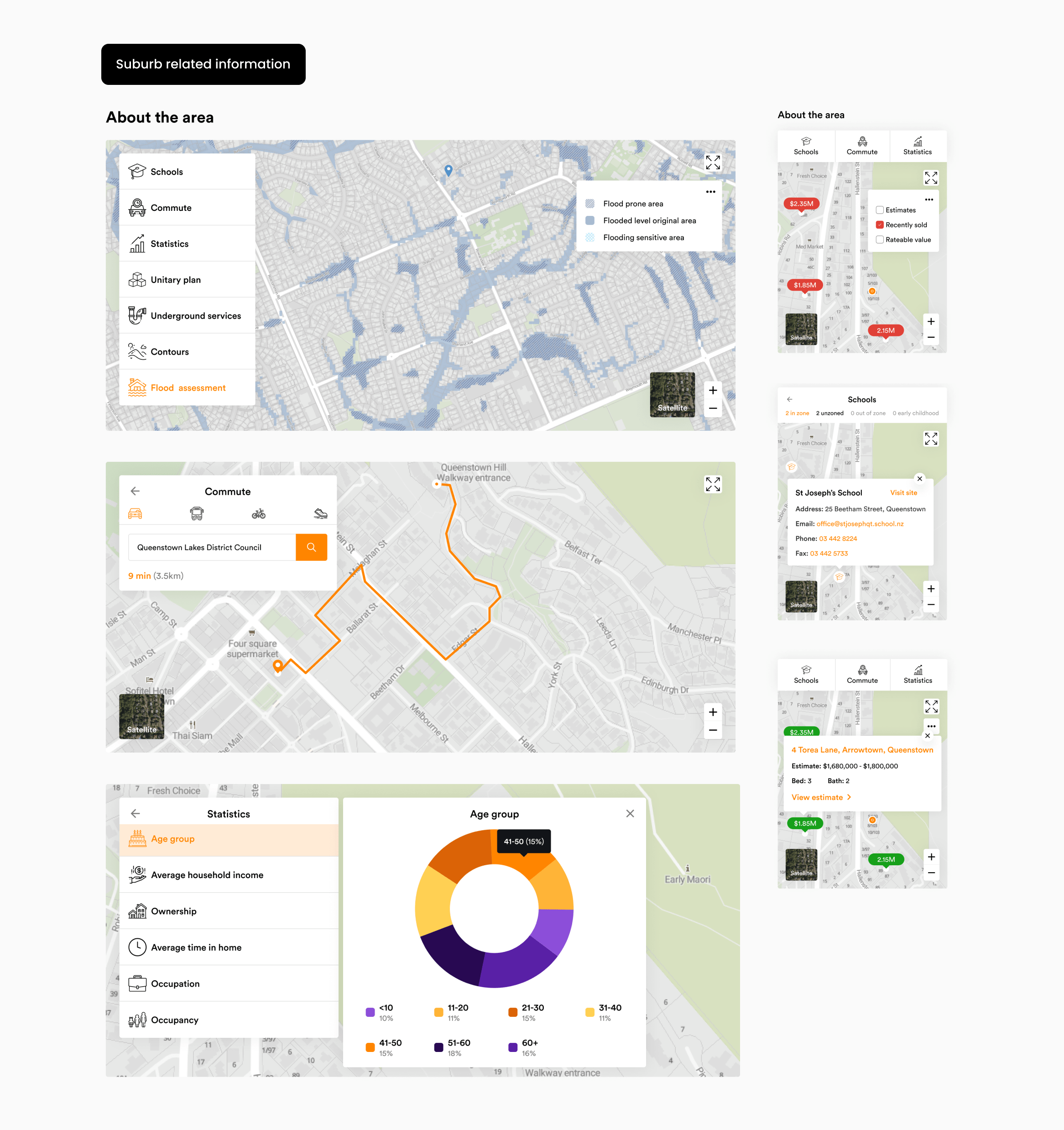
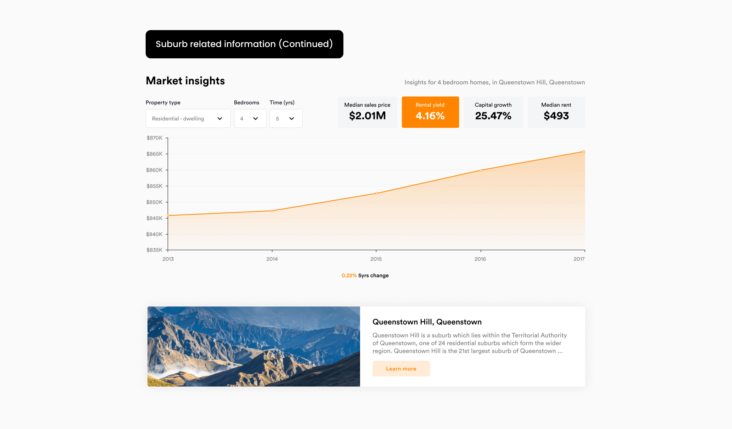
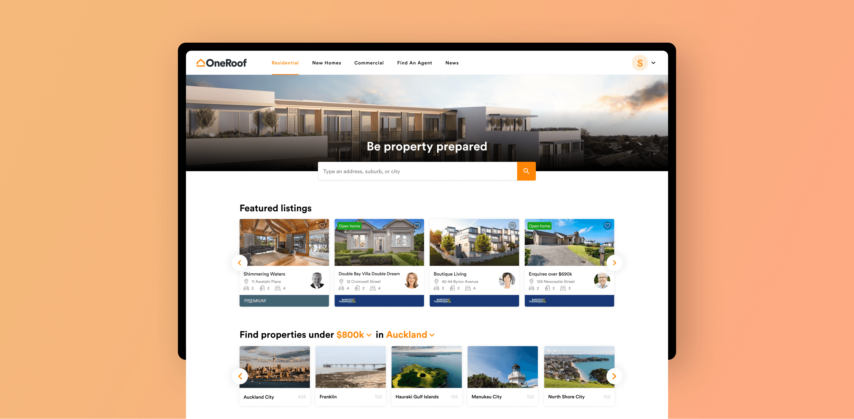
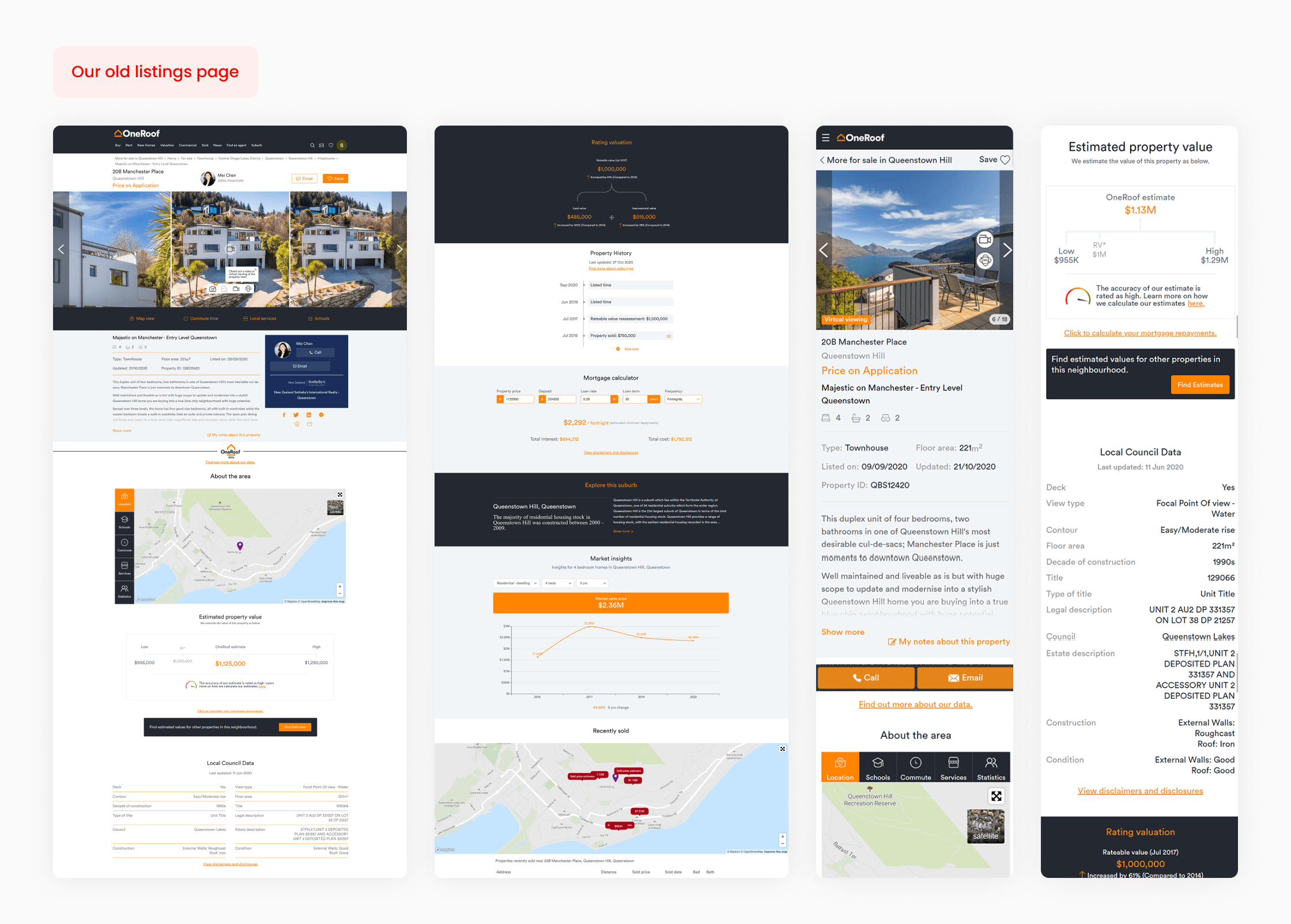
The listings page contained valuable information, but the experience made it hard to access. It was long, illogically ordered, and difficult to scan, meaning many users weren't reaching key content before dropping off. An Omnibus survey (Sep 2020) also highlighted a broader usability perception gap, with only 4% of users rating OneRoof as “easy” to use compared to competitors. The page needed to:
Improve the listings journey by making high-value information easier to find, faster to understand, and simpler to navigate, while retaining the depth of content users came to OneRoof for.
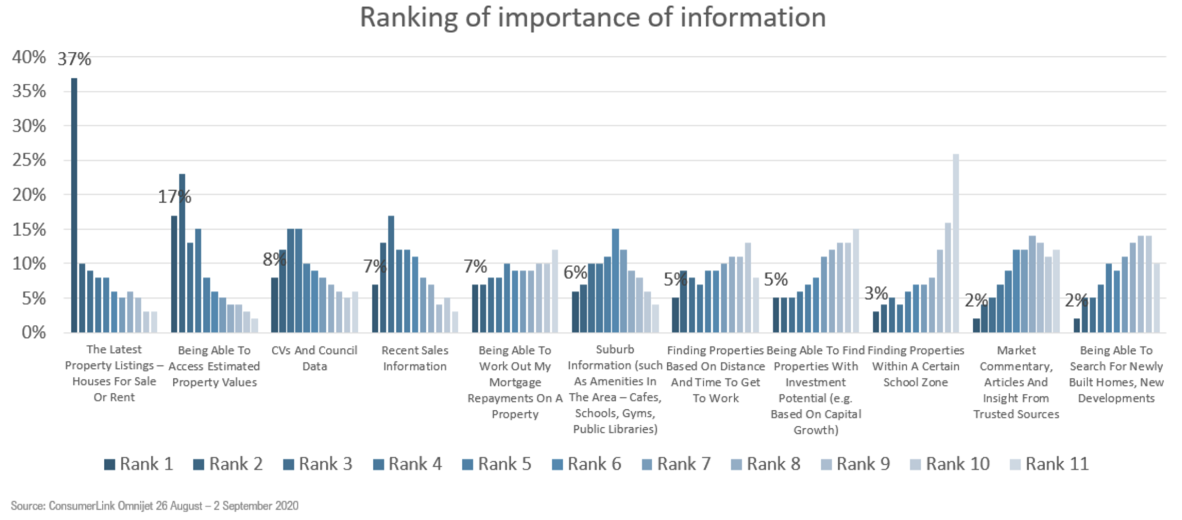
The existing page offered a lot of detail, but users struggled to locate the information they cared about most. Omnibus survey data helped us rank what mattered most to property hunters:
This gave us a clear basis for restructuring the page around user value rather than internal content ordering.
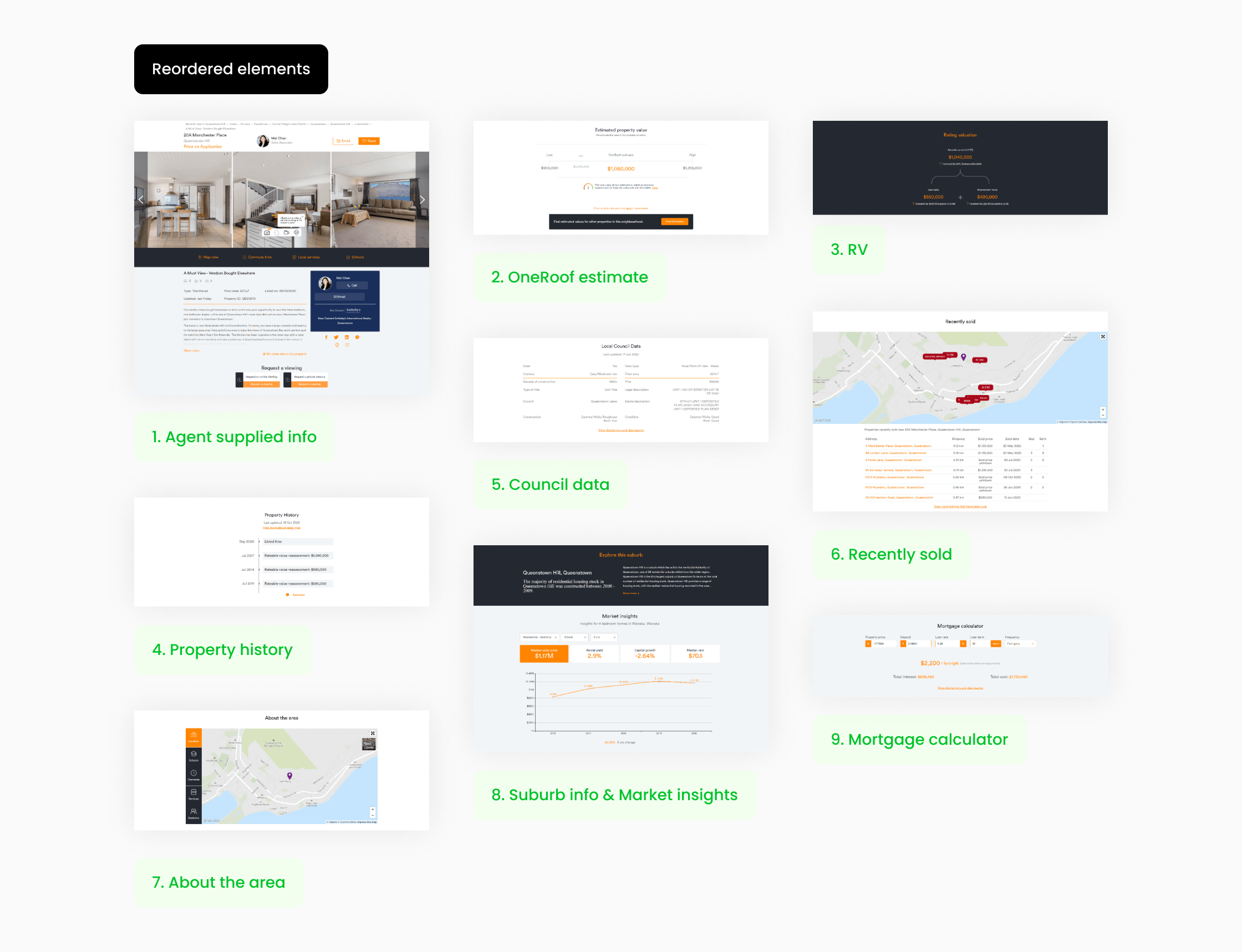
Before redesigning visuals, we tested whether reordering content alone would change behaviour. Across variants, we kept agent-supplied listing information and contact details at the top and focused tests on reordering OneRoof-supplied content beneath it.
Key shifts included:
The reorder had an immediate impact on the estimates page, increasing registrations on page by 17.4%. On the listings page, the reorder had no meaningful impact on user behaviour, suggesting the issue wasn't only order, but how content was structured and navigated. Based on this, we implemented the reorder changes and moved into grouping.
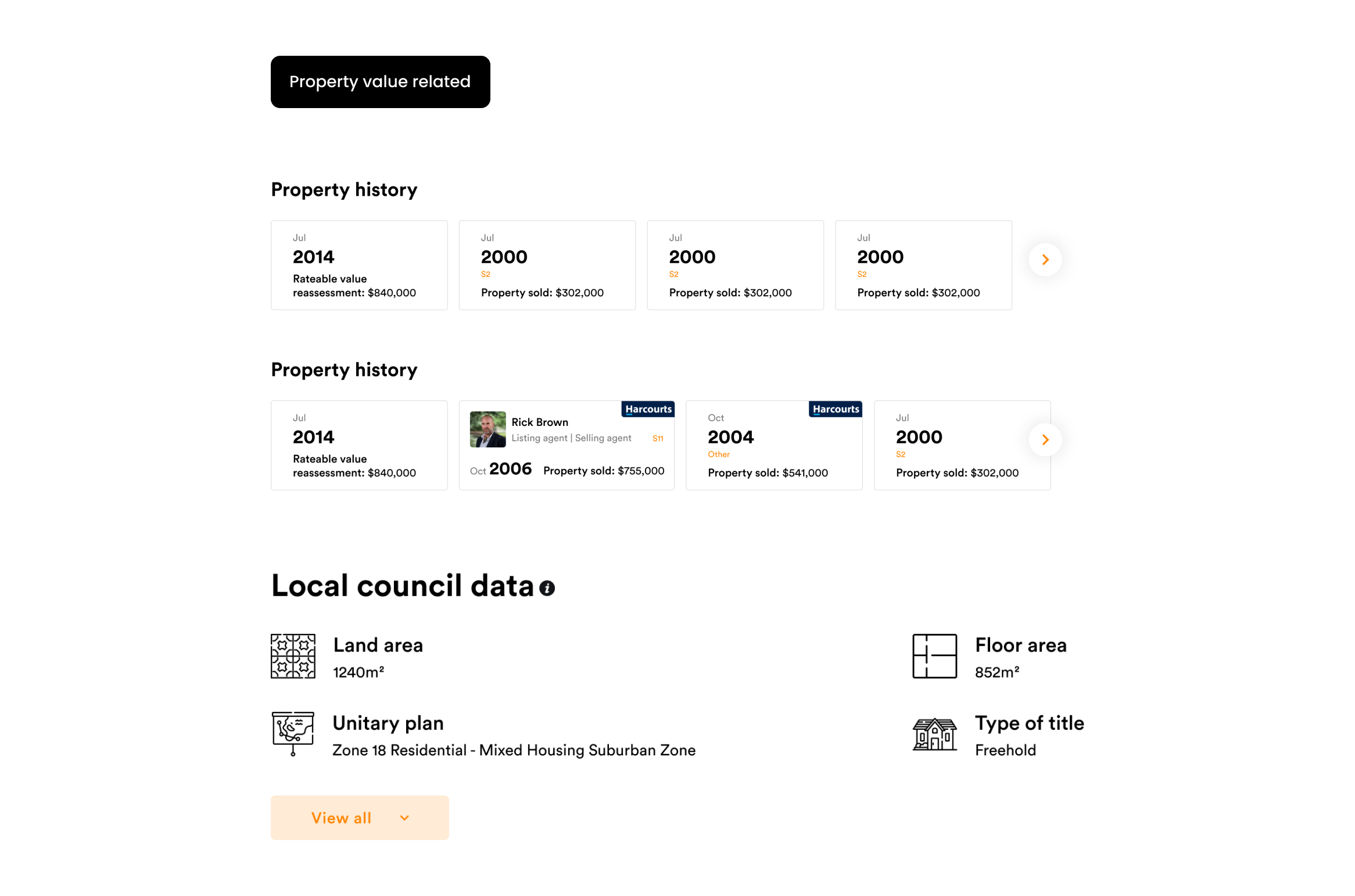
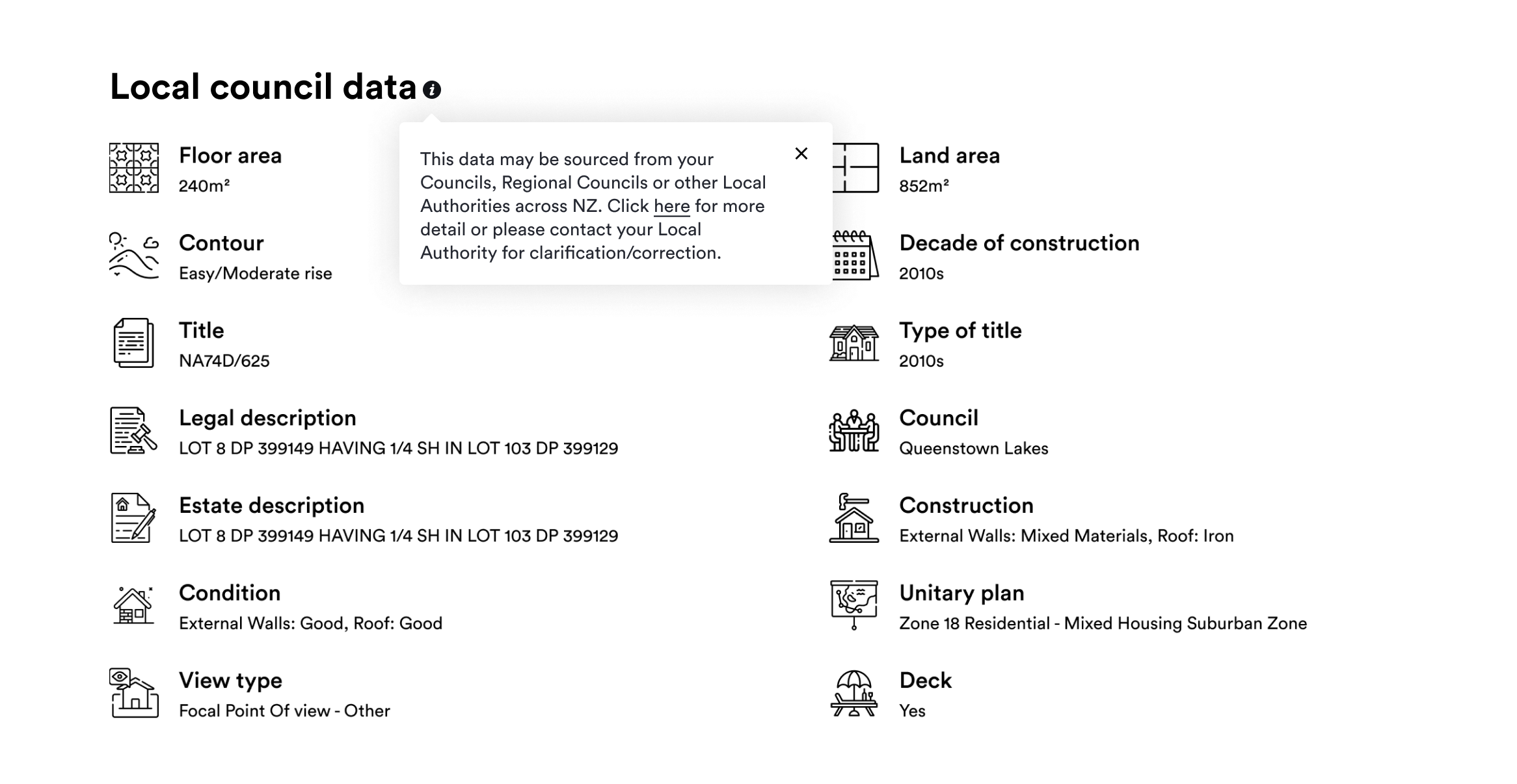
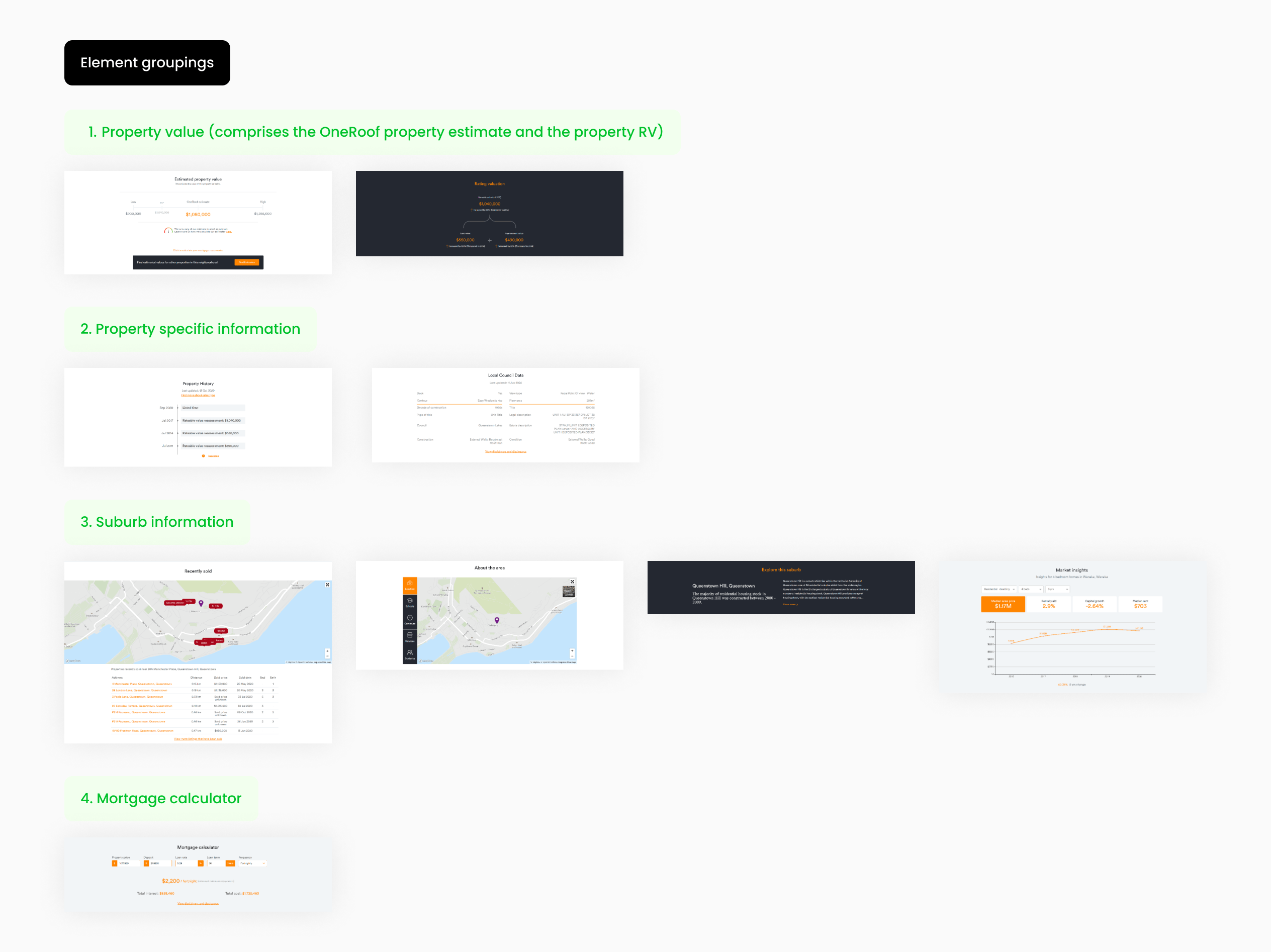
We then grouped related content to help users locate information faster without continuous scrolling. Groupings were based on content that naturally belonged together.
Examples of grouping logic:
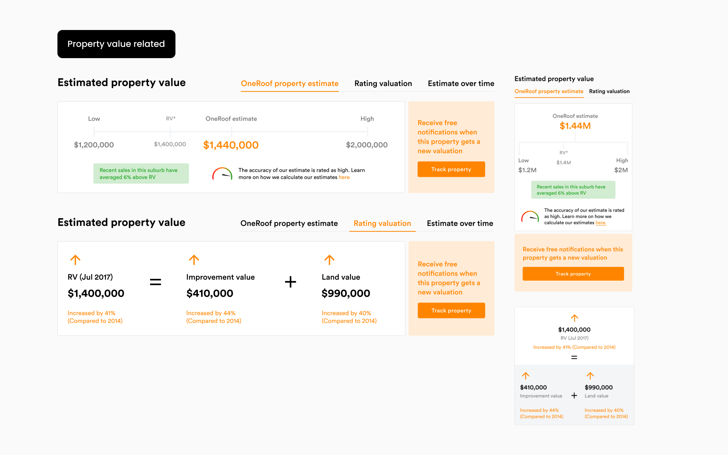
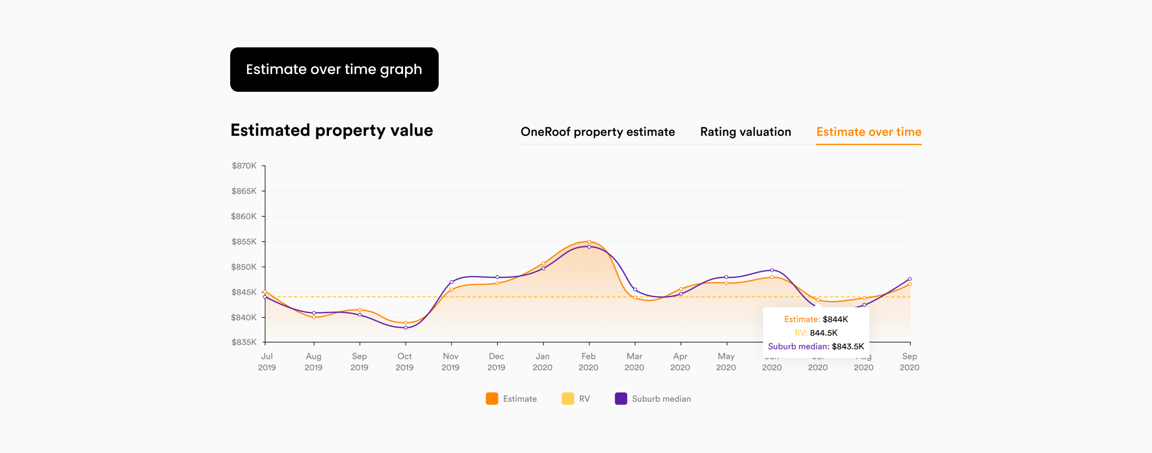
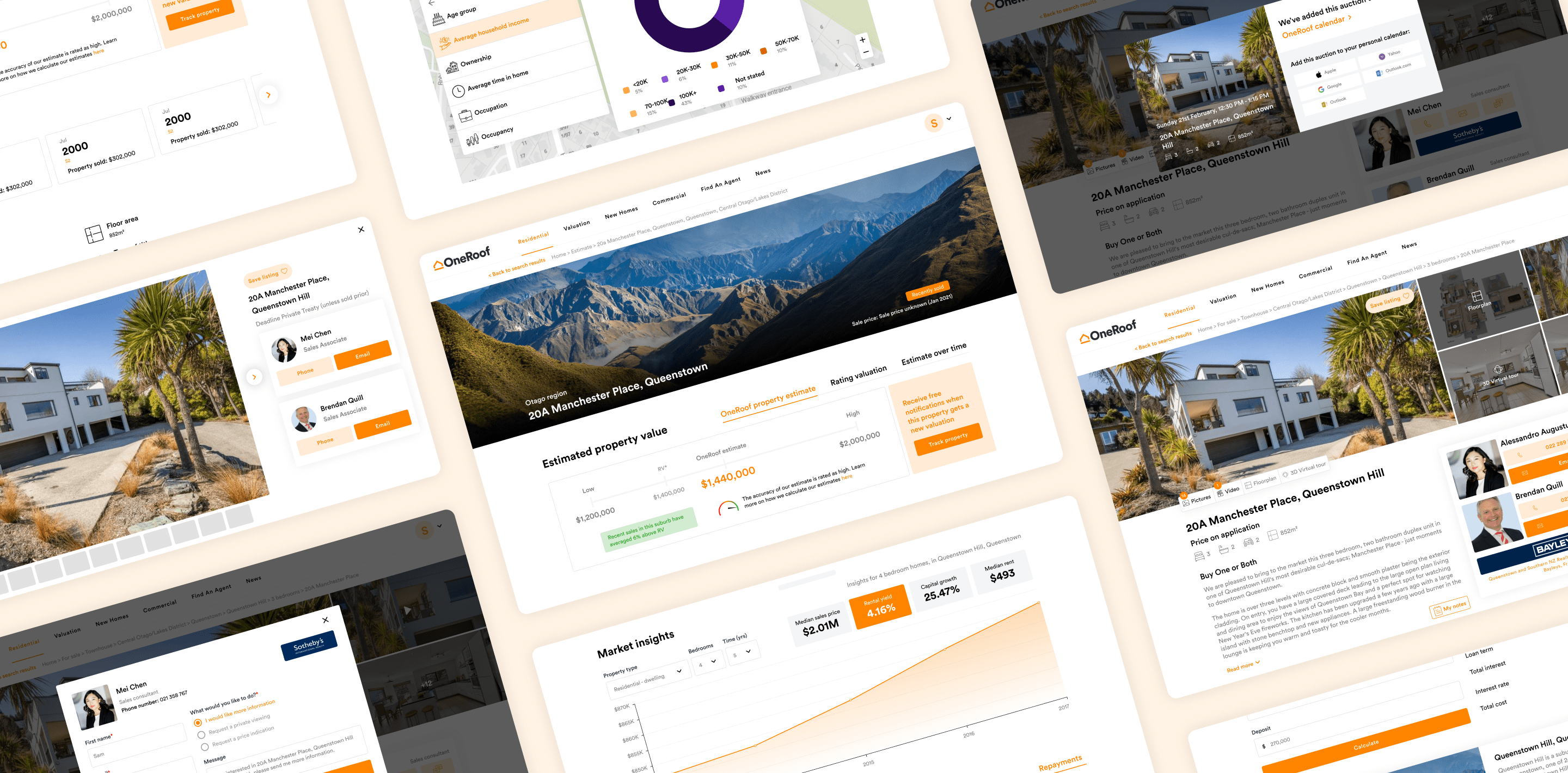
With the new order and groupings in place, we redesigned the page using a tabbed pattern. This allowed the page to retain the same depth of content while reducing overall length and improving navigation. It also gave us clearer behavioural signals (tab clicks) to understand which information users actively engaged with.
Visually, the refresh focused on clarity and consistency with the redesigned homepage and style guide, using spacing, hierarchy, and cleaner font sizing to make dense information easier to scan. The redesigned elements are shown below the results section.
The redesign created a cleaner, more intuitive experience across listings and estimates. We reduced page length by ~30% across desktop and mobile while retaining the same depth of content.