1 Product Designer, 1 Product Manager, 1 CRO Manager, 1 Quality Assurance Engineer, Off-site Engineering Team
Discovery, UX/UI design, design system, interaction design
Figma, UsabilityHub
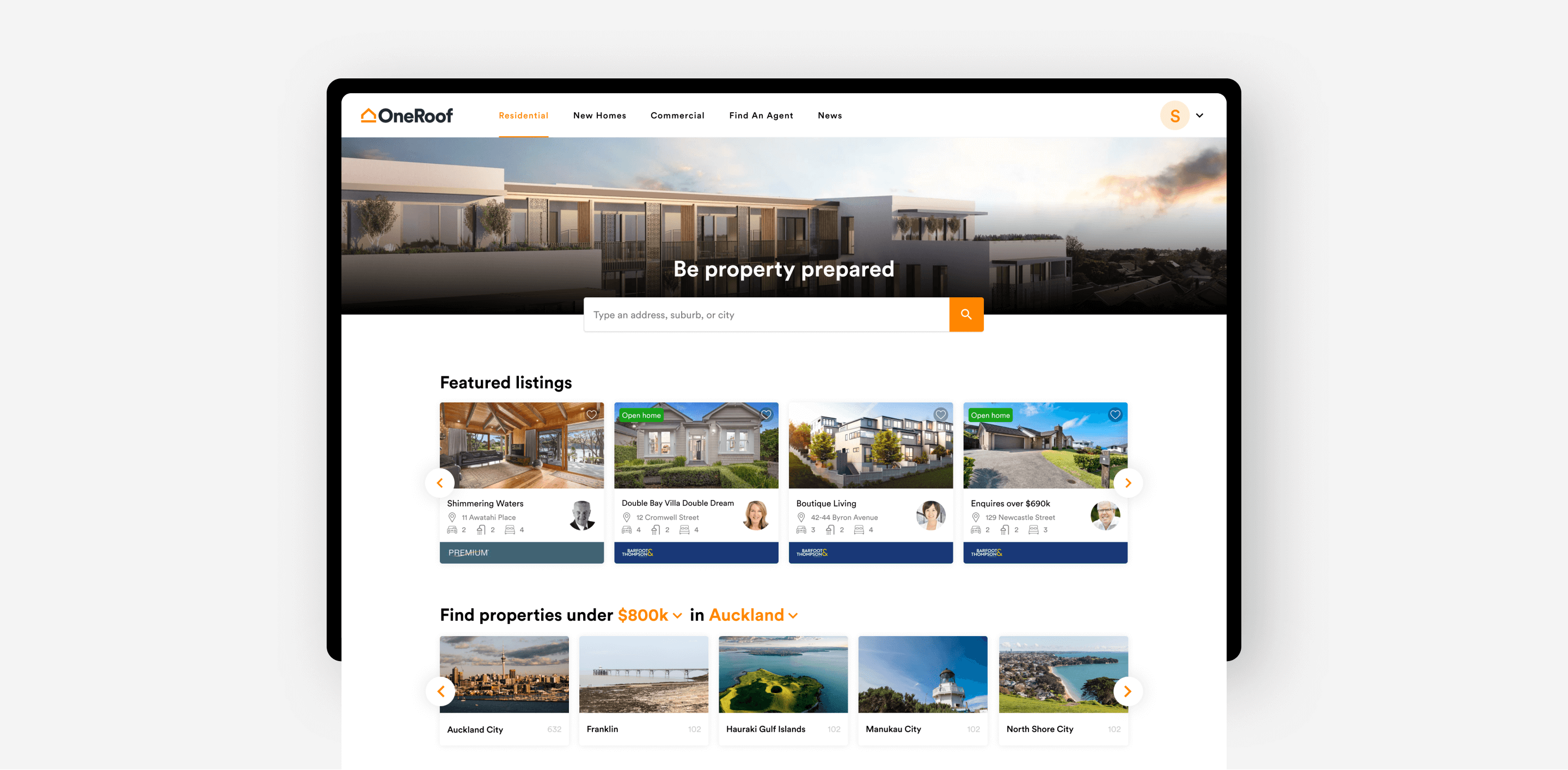
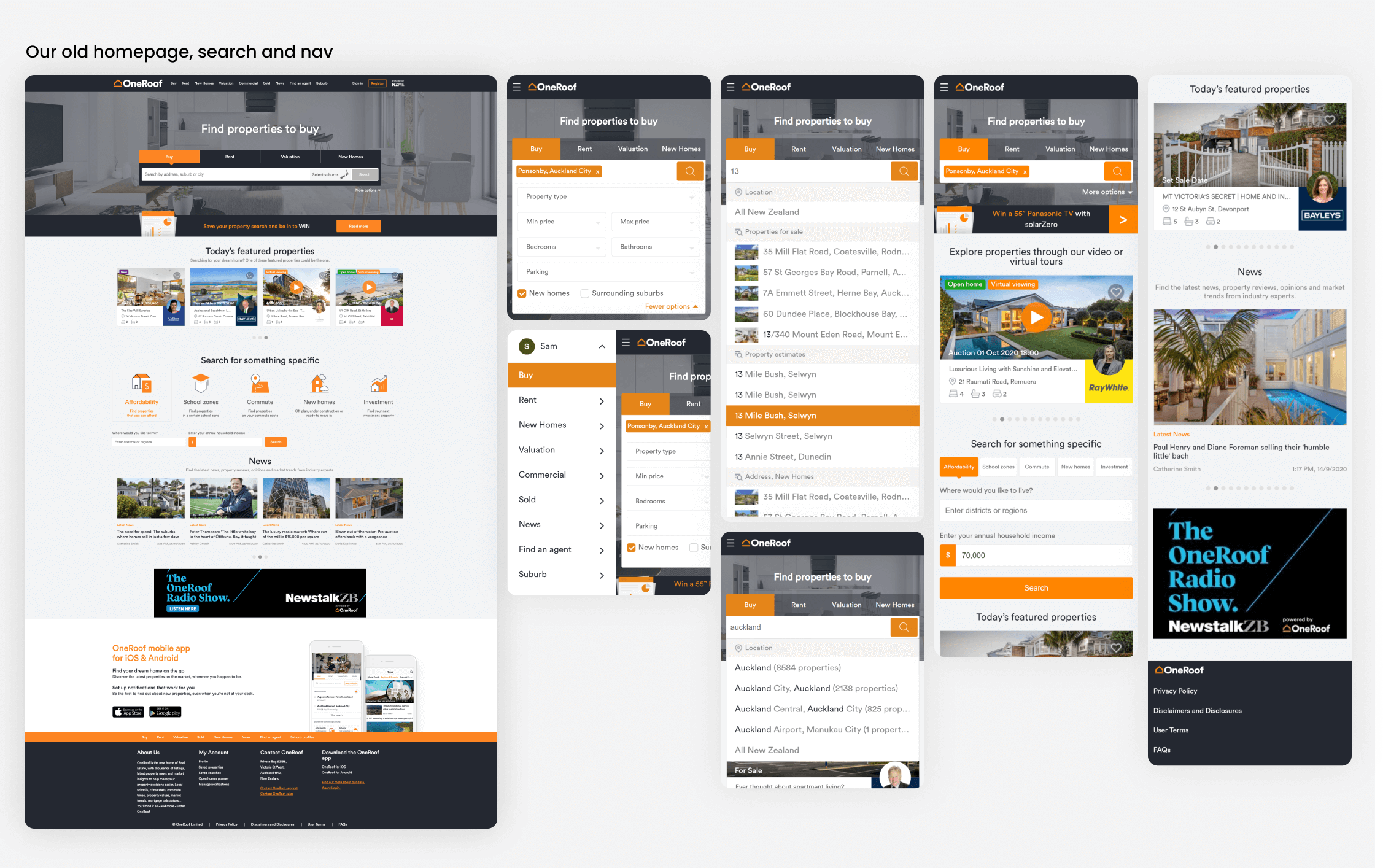
The OneRoof homepage is a high-traffic entry point into property search, listings, and editorial content. Over time, it had accumulated multiple entry points and competing priorities, making it difficult for users to understand where to start or how to continue an existing journey. The homepage had:
Rather than adding or removing features, the goal was to:
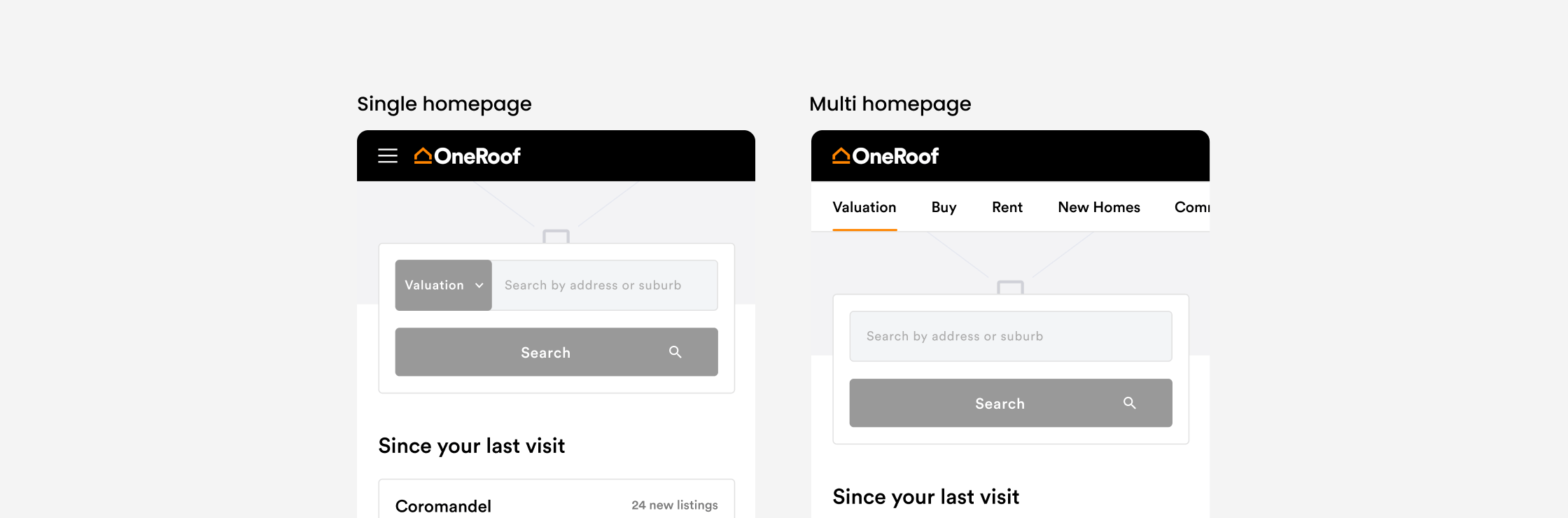
Two primary structural approaches were explored:
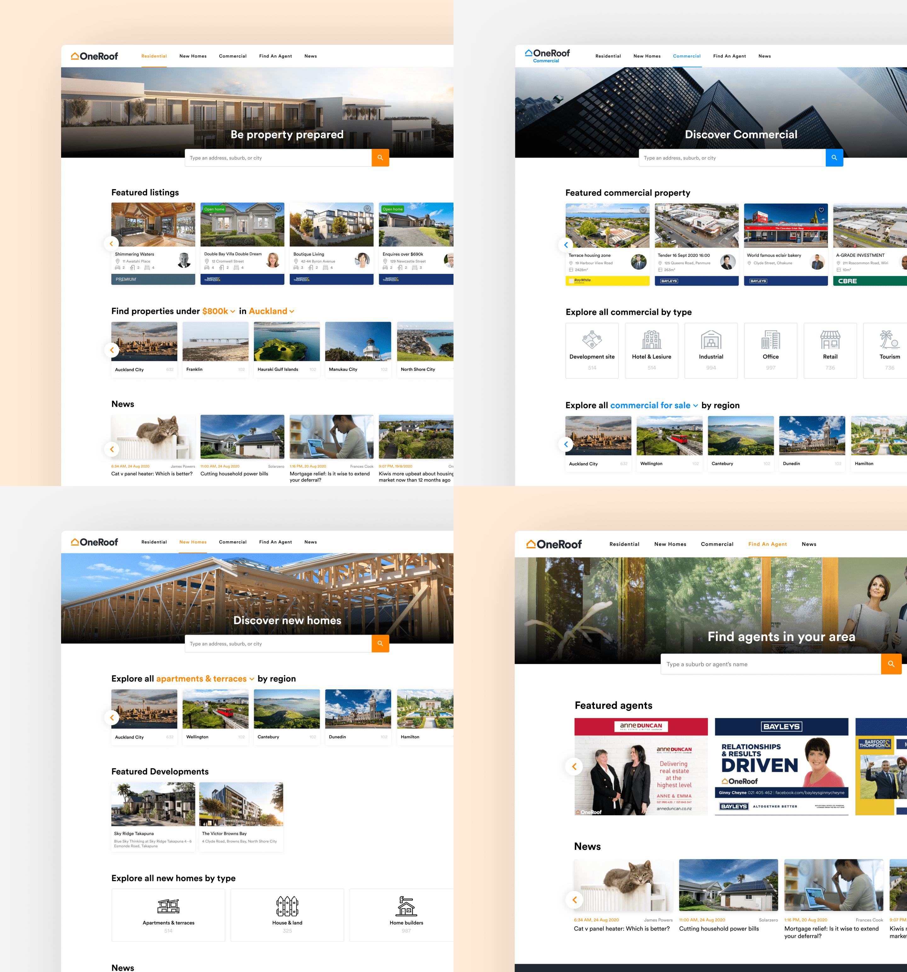
Preference testing showed a clear user preference for the multi-homepage model due to its ease of use. Instead of choosing one model outright, we explored a hybrid approach that kept familiar entry points while reducing duplication.
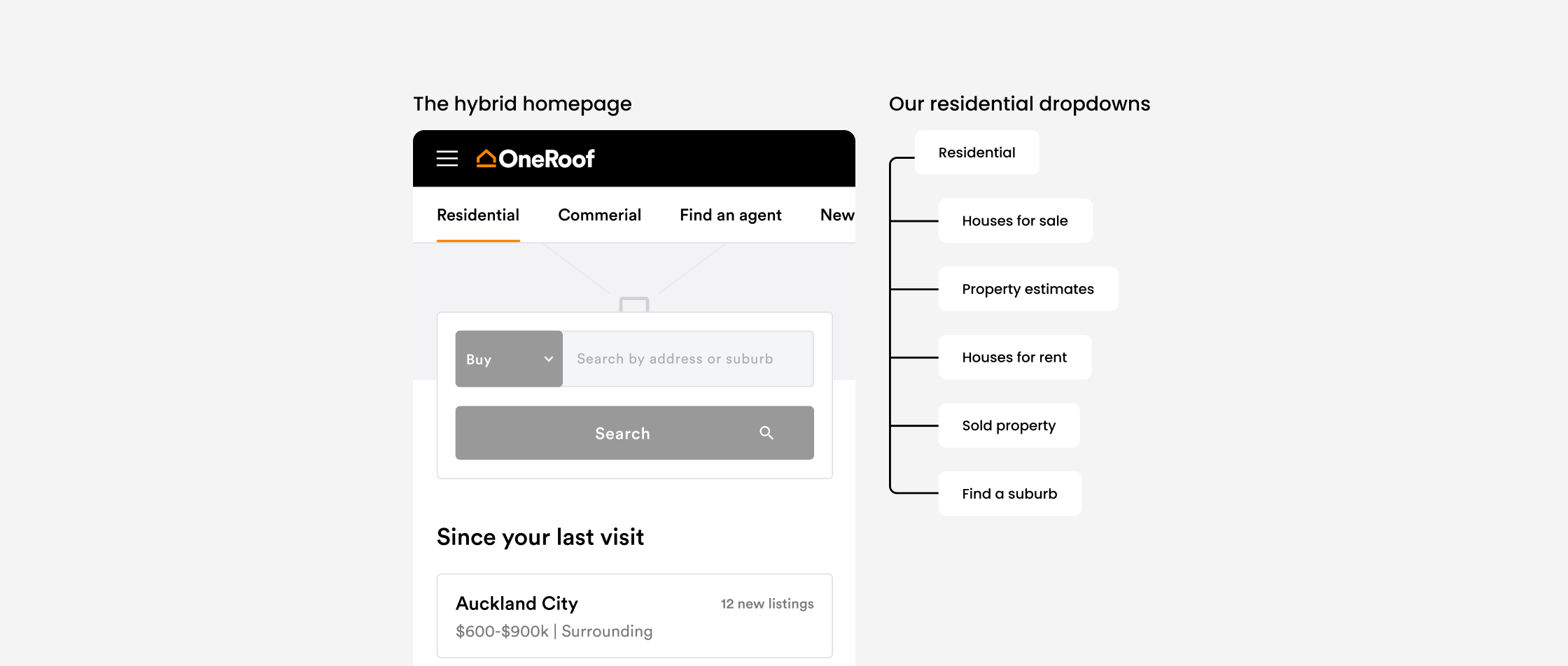
Rather than forcing users into a single rigid path, we grouped related actions into clearer, more predictable clusters:
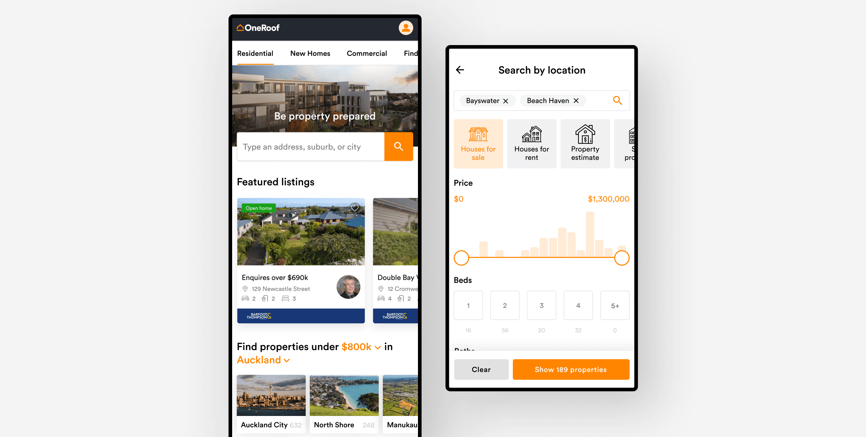
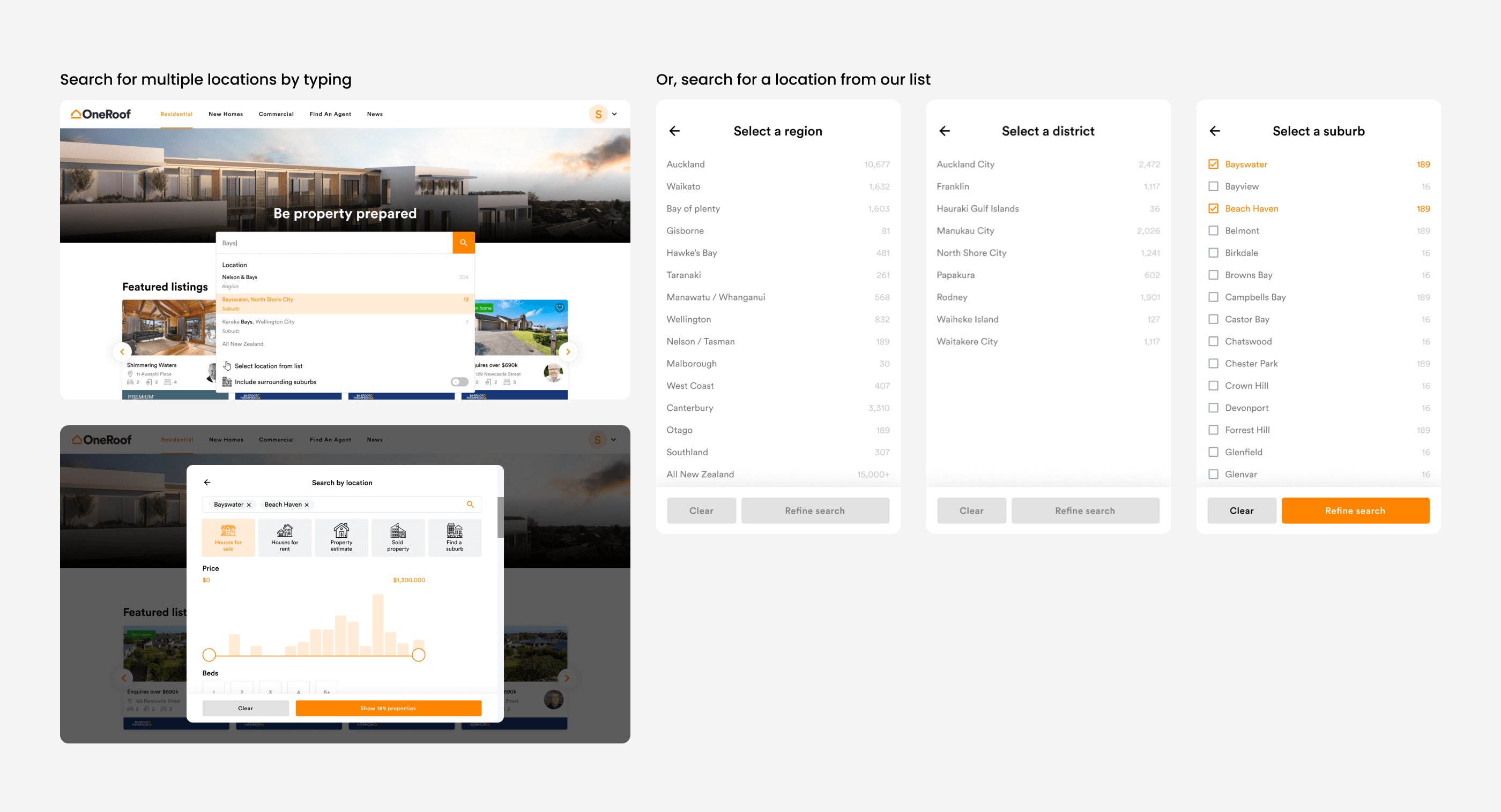
The hybrid homepage introduced a clearer navigation structure, making it easier to move between key sections. This approach also highlighted an opportunity to further simplify our search journey, making us wonder if a user selecting a location first could work better than a user selecting a search type and a location at the same time.
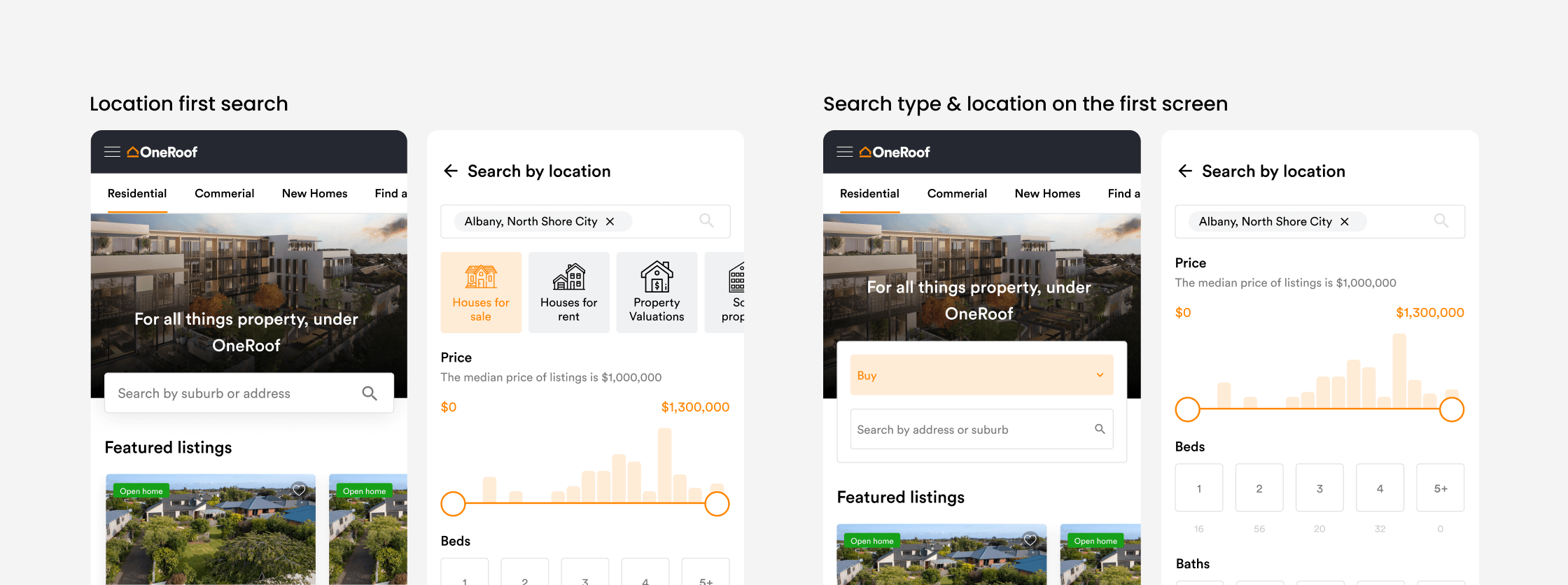
A review of local and international property platforms revealed two dominant patterns:
67% of peers prioritised location as the primary decision, so we tested both models with our users within our platform to see which they preferred. 79% of participants preferred a location-first approach, finding it more intuitive and easier to recover from mistakes.
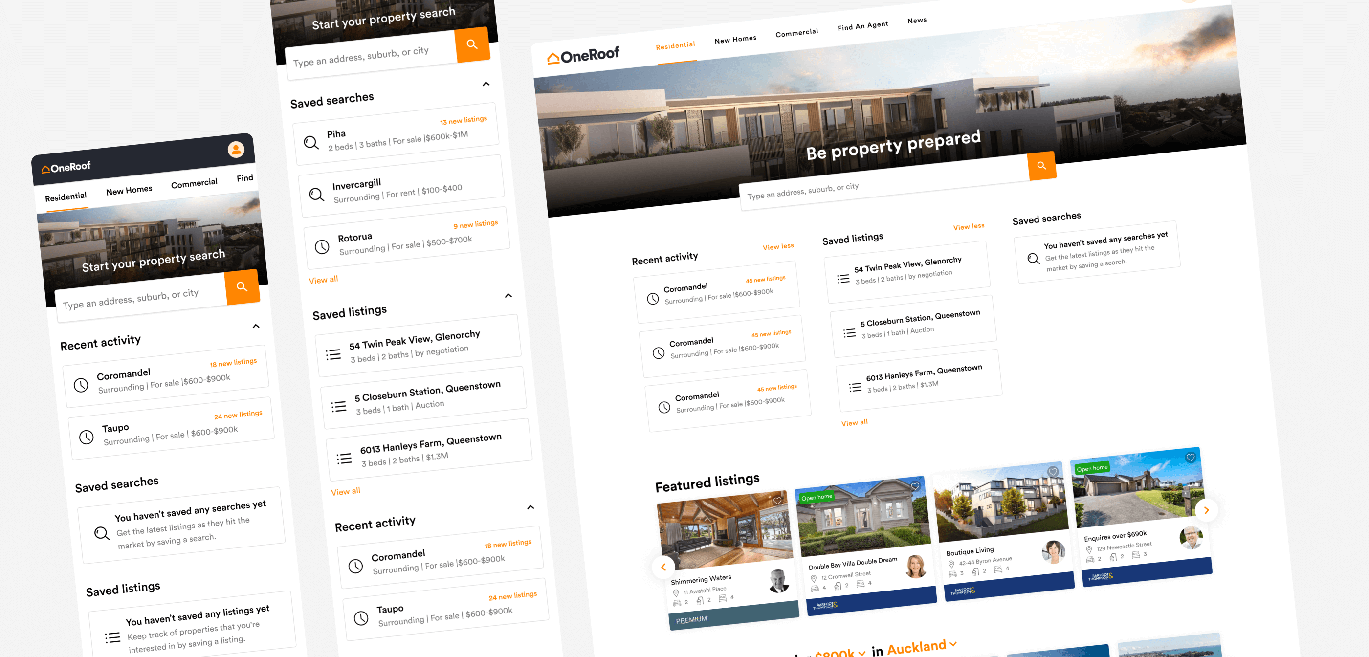
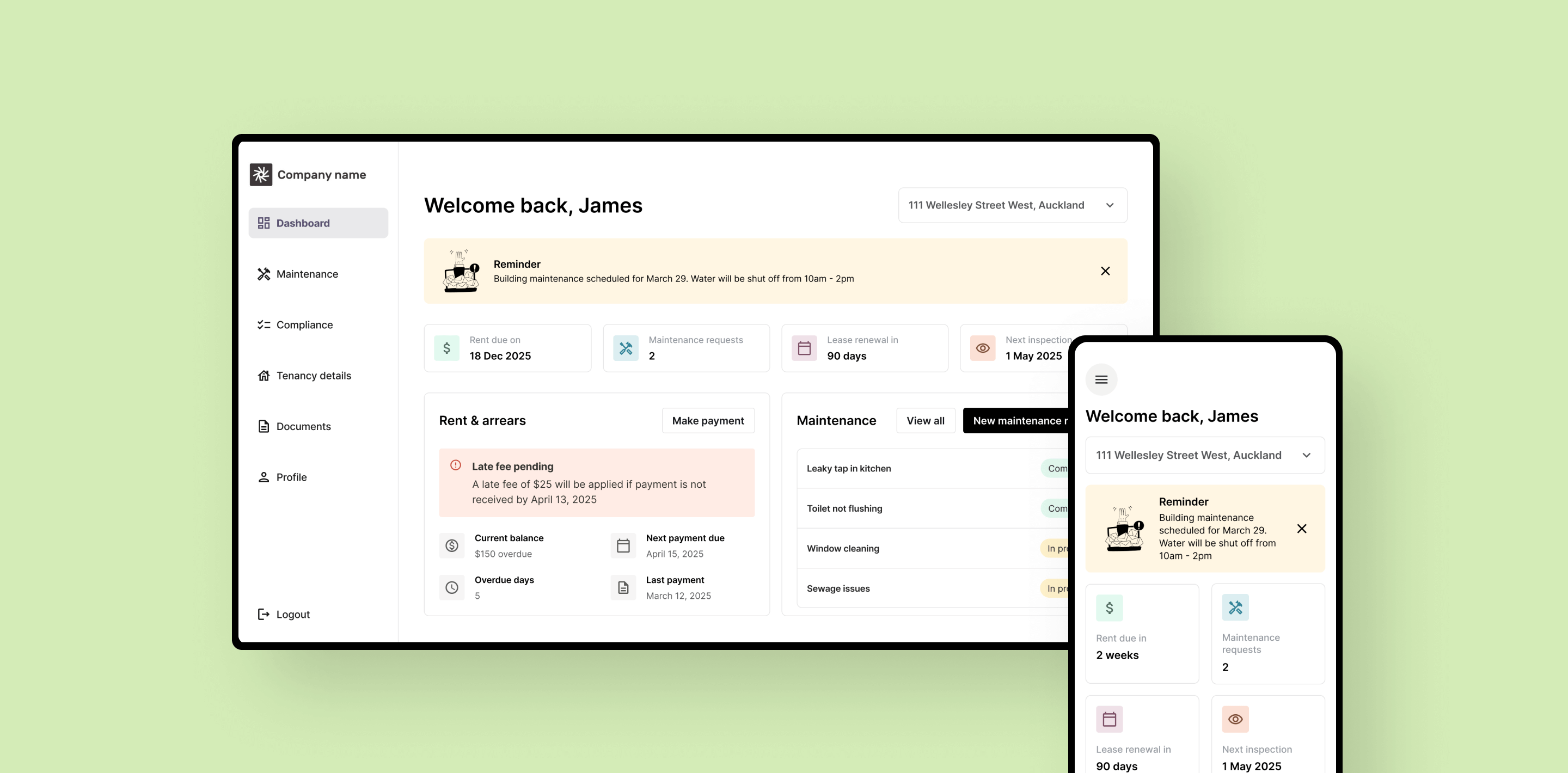
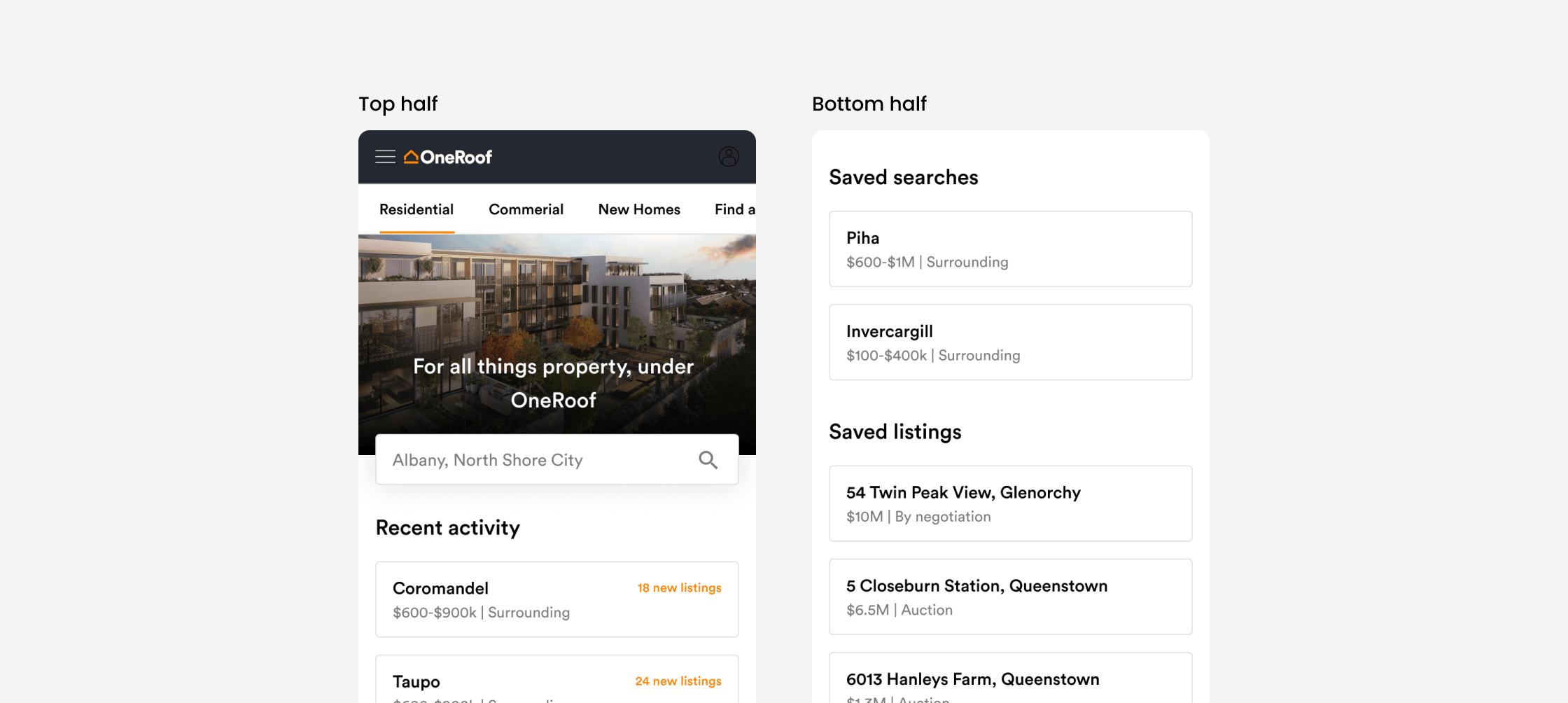
Through user behaviour and analytics, we identified three broad user states:
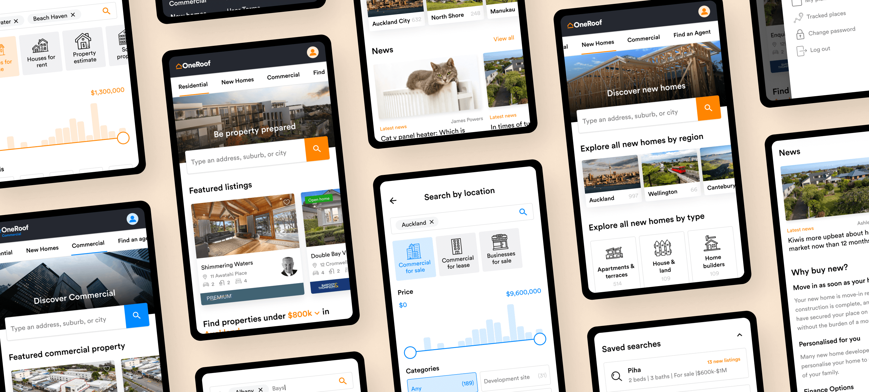
The existing homepage treated all users the same, a missed opportunity to surface relevant content earlier to keep users sticky. Based on this, we introduced personalised sections for both our returning and logged-in users, surfacing their recent activity and saved searches/properties on the homepage. These were iterated on through testing to ensure relevance without distracting new users.
Following launch, we saw measurable improvements across key engagement metrics:
These outcomes indicated stronger onward journeys and increased session depth, validating the decisions we made throughout the project.